What Is RGB and CMYK? What Every Children’s Book Illustrator Should Know
As a children’s book illustrator, understanding color models is crucial to ensure your artwork looks its best in both eBooks and print books. Two key color models you'll encounter when illustrating children's books are RGB and CMYK color profiles. By understanding the difference between these two color modes you can select the best ones for print or eBooks. Let's dive into what these acronyms mean and how they affect your illustrations.
What Is RGB and CMYK?
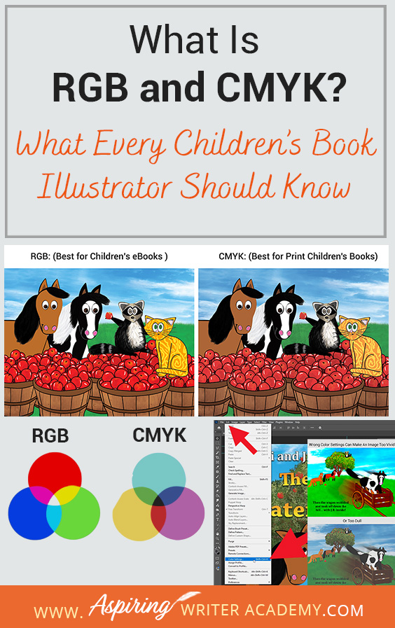
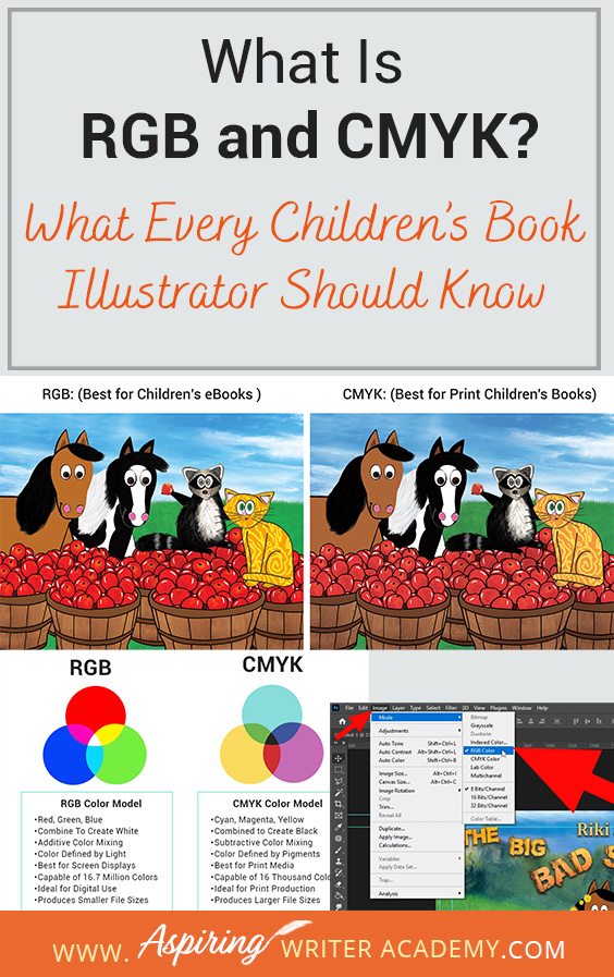
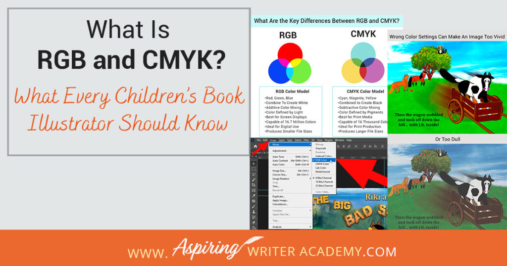
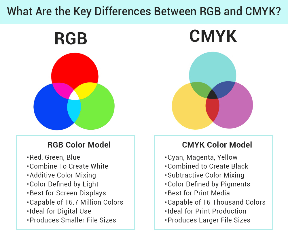
RGB and CMYK are the two fundamental color models used in creating digital and print media. RGB stands for Red, Green, and Blue, and is used for digital displays such as monitors, tablets, and smartphones. It combines these three colors in various intensities to create a broad spectrum of vibrant hues, making it ideal for eBooks and other digital formats. On the other hand, CMYK stands for Cyan, Magenta, Yellow, and Key (Black) and is used in printing. So RGB is best for eBooks and CMYK is best for print children's books. CMYK model works by subtracting light to produce colors, which ensures accurate and consistent color reproduction on paper, making it the go-to choice for print books.
As an illustrator, I always start my designs in RGB and then convert them to CMYK for print. This approach leverages the broad color gamut of RGB, allowing for more vibrant and dynamic illustrations and I have found that this works better than working in CMYK and switching to RGB color. This also helps me avoid those weird, overly bright, or dull colors and keeps my graphics looking just right on screen and in print.
When I was 17 and in college, I took Adobe Illustrator for the first time and started the initial illustrations for our children's book, "Riki and JR and the Big Bad Scary Mudpuddle." I made the mistake of designing these pages directly in CMYK color mode. The colors appeared flat and dull on the eBook version, which drove me crazy. This led me to switch to RGB for my designs. However, I was then baffled by why RGB graphics printed so dark and didn't look the same as they did on the computer.
After doing a lot of research, I learned that the best approach is to design in RGB for vibrant digital images and then convert to CMYK for print. By experimenting with the first few pages of our book, I discovered that starting in RGB and switching to CMYK as needed gave me the best results. This method ensures my illustrations are engaging online and maintains their color integrity in print.
Designing in RGB first provides flexibility and better results for digital platforms. Converting to CMYK before finalizing for print ensures that the colors remain true to the original vision while adapting to the constraints of print media. This method enhances the visual appeal of my work across both formats, ensuring a vibrant digital presence and high-quality prints.
RGB: The Digital Color Model (Best for eBooks and Online Marketing)
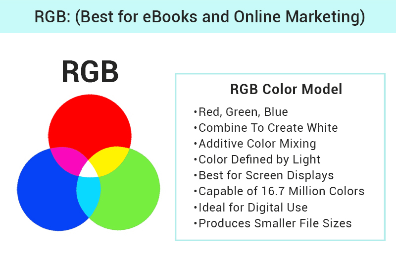
RGB stands for Red, Green, Blue. It’s the color model used for digital displays, such as computer monitors, tablets, and smartphones. In the RGB model, colors are created by combining red, green, and blue light in various intensities. Here’s what you need to know:
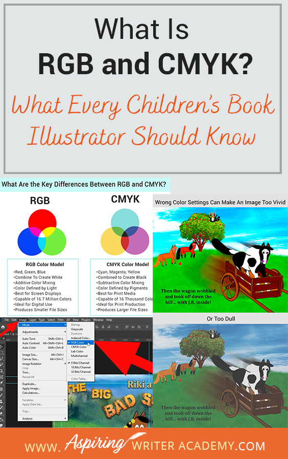
1. Additive Color Mixing: RGB is an additive color model, meaning colors are created by adding light. When all three colors are combined at full intensity, they produce white light.
2. Color Range: RGB has a wide color gamut, offering vibrant and diverse color options, which is why it’s ideal for digital artwork. RGB color models are capable of over 16.7 million colors.
3. Applications: Use RGB when creating illustrations that will be viewed on screens, such as eBooks, websites, and social media.
CMYK: The Print Color Model (Best for Print Children's Books)
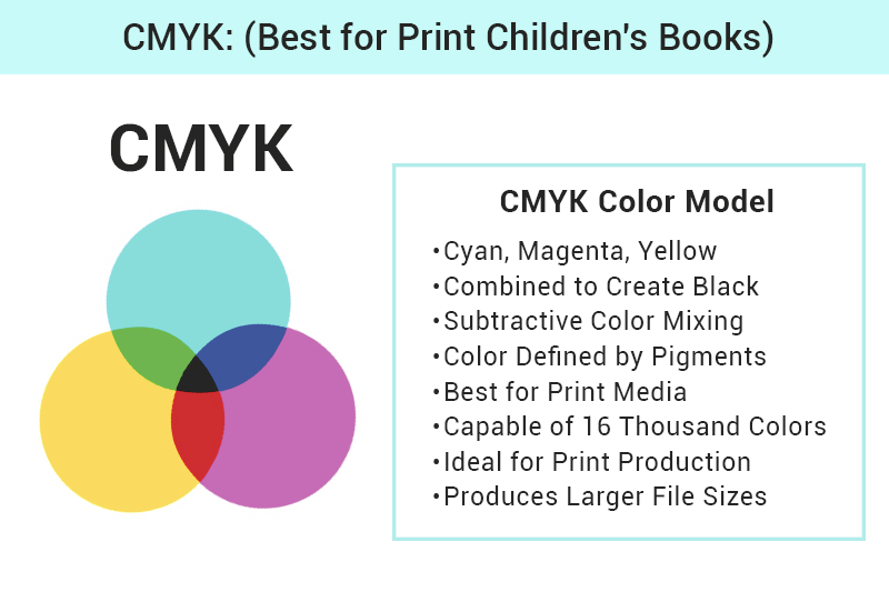
CMYK stands for Cyan, Magenta, Yellow, and Key (Black). This model is used for printing and works by subtracting light. Here’s a breakdown:
1. Subtractive Color Mixing: CMYK is a subtractive color model, meaning colors are created by subtracting light. When all colors are combined, they absorb (subtract) all light, resulting in black.
2. Color Accuracy: CMYK is essential for accurate color reproduction in printed materials. It doesn’t have as wide a color gamut as RGB, so some colors may not appear as vibrant in print. CMYK is only capable of 16 thousand colors.
3. Applications: Use CMYK for physical copies of children’s books, posters, and any printed marketing materials.
Why Does Choosing RGB or CMYK Matter for Children’s Book Illustrators?
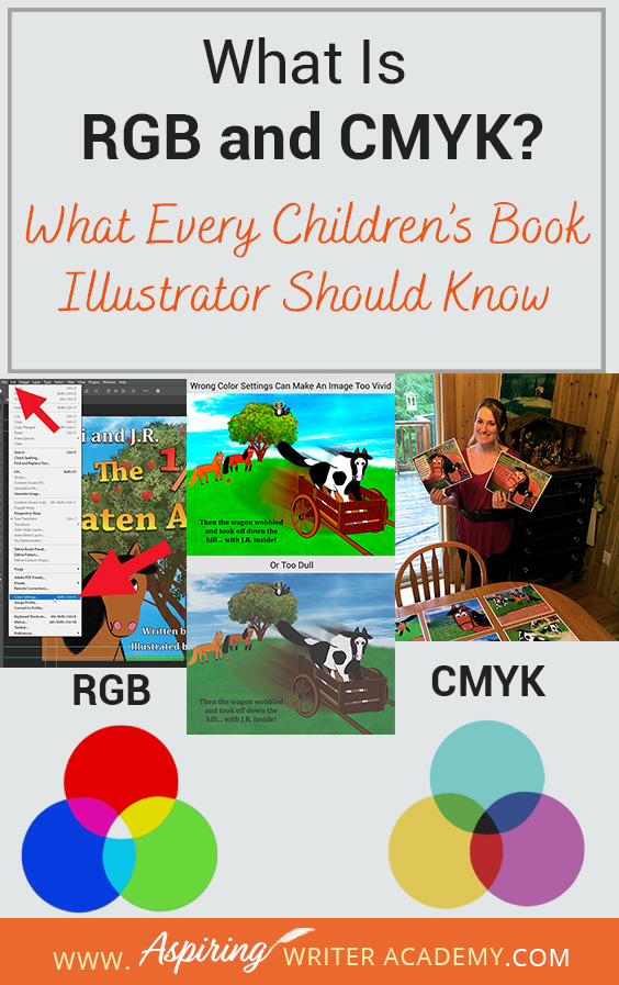
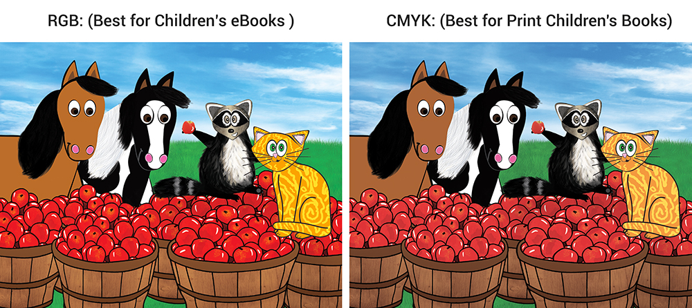
Choosing the right color model—RGB or CMYK—is crucial for children's book illustrators because it affects how your images turn out in print and on screens. RGB, which is used for digital displays, creates bright and vibrant colors thanks to light. But if you print RGB images using CMYK (which is based on pigments), they can turn out unexpectedly dull since CMYK has a more limited color range. On the flip side, CMYK images viewed on an RGB screen can look overly vivid and unrealistic, making them appear distorted. To keep your illustrations looking their best and ensure they look great in both formats, it's important to use the right color model for your end medium. Here are some simple tips to help you get the best results:
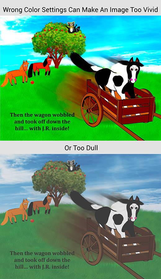
1. Start with RGB: Begin your illustrations in RGB to take advantage of the broader color range. This allows for more vibrant and dynamic artwork.
2. Convert to CMYK for Print: Before finalizing your work for print, convert your files to CMYK. This helps you see how your colors will look in print and make any necessary adjustments.
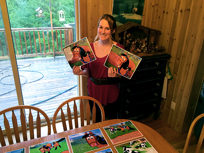
3. Proof Your Work: Always proof your illustrations in both RGB and CMYK. Print a sample copy to check color accuracy and ensure your artwork maintains its integrity across formats.
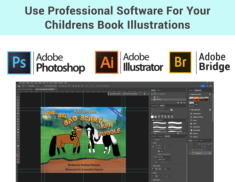
4. Use Professional Software: When it comes to managing colors effectively, especially when switching between RGB and CMYK, it’s crucial to use professional software like Adobe Photoshop or Adobe Illustrator. These tools offer advanced color management options that free software often lacks, providing greater control over your design process. Many authors and designers mistakenly rely on free or less robust programs that don’t offer the same level of precision, which can lead to color inconsistencies and issues during printing.
For those looking to create or refine their children's book illustrations, adjusting color settings in professional software is essential for ensuring that your images look their best both on screen and in print. To make this process easier, consider downloading a 7-day free trial of Adobe Photoshop, or purchasing the program to gain full access to all the features you'll need for your project. This will allow you to adjust RGB or CMYK images with ease, ensuring your colors are accurate and vibrant across different media.
Steps On How to Convert Children's Book Illustrations from RGB to CMYK
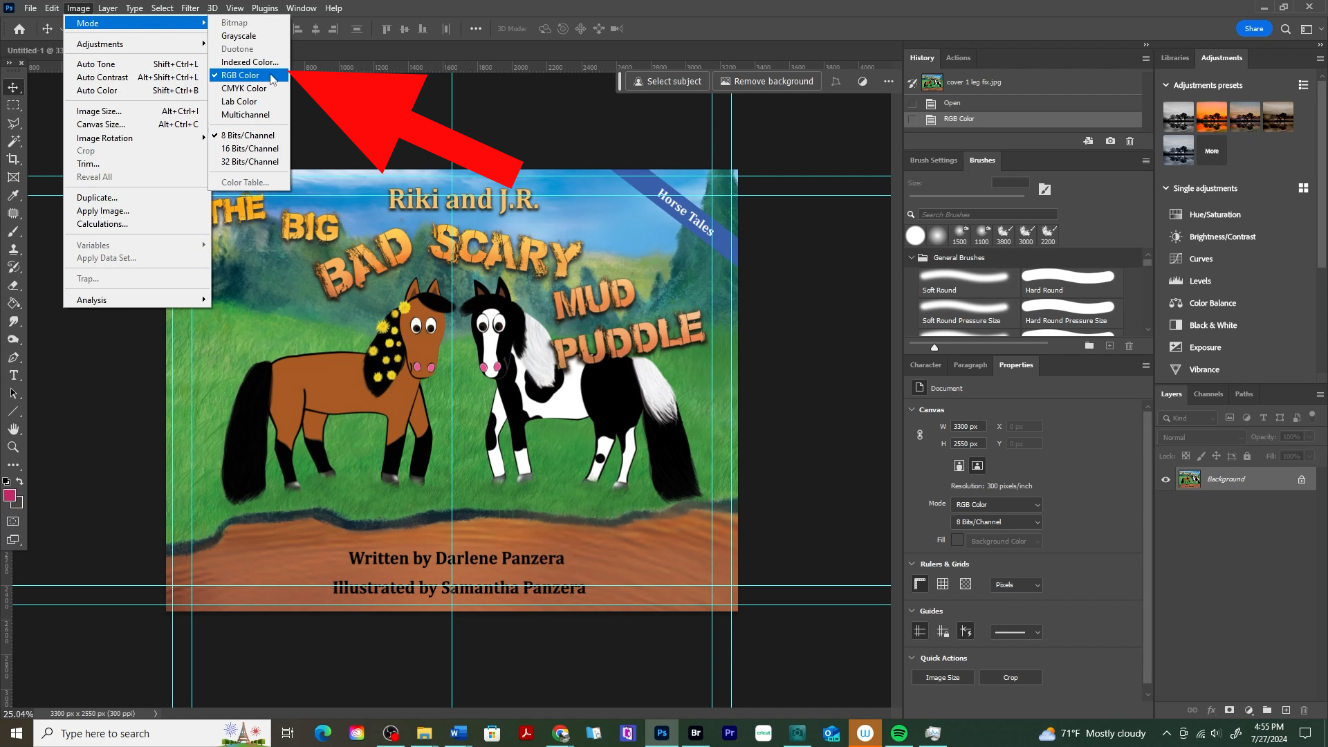
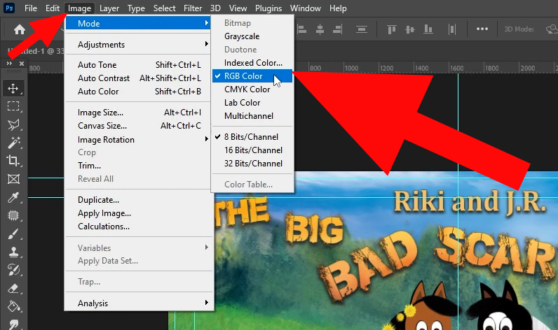
1. Use Adobe Photoshop: Open your RGB file in Photoshop. Go to Image > Mode > CMYK Color to convert your file. Adjust colors as needed.
2. Soft Proofing: Use soft proofing to simulate how your colors will look in print. Go to View > Proof Setup > Working CMYK.
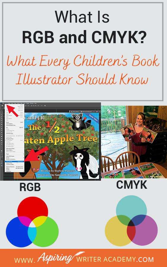
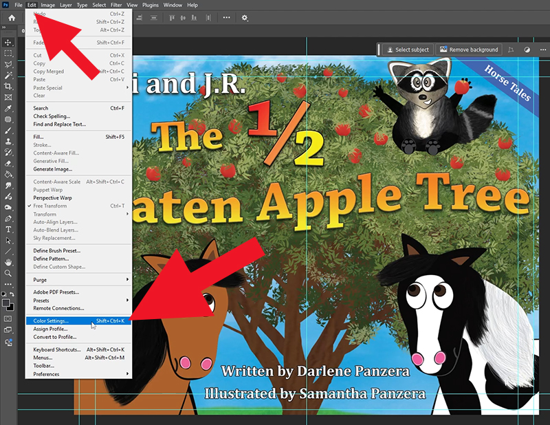
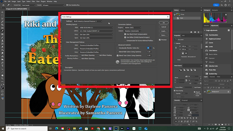
3. Check Color Profiles: Ensure you’re using the correct color profiles for your printer. This can be found under Edit > Color Settings.
By mastering both RGB and CMYK color profiles, you can ensure your illustrations look stunning in any medium, whether it’s on electronic devices or in print. This blog post is designed to help you understand these color profiles and how to use them to maintain the quality and vibrancy of your artwork. Keep experimenting and refining your skills to create beautiful, colorful worlds that parents, grandparents, and children will love.
Books Used as Examples:
We Believe All Authors Can Aspire to Take Their Writing to the Next Level!
Our Goal for Aspiring Writer Academy is to help people learn how to write quality fiction, teach them to publish and promote their work, and to give them the necessary tools to pursue a writing career.
Do you find it difficult to create compelling antagonists and villains for your stories? Do your villains feel cartoonish and unbelievable? Do they lack motivation or a specific game plan? Discover the secrets to crafting villains that will stick with your readers long after they finish your story, with our How to Create Antagonists & Villains Workbook.
This 32-page instructional workbook is packed with valuable fill-in-the-blank templates and practical advice to help you create memorable and effective antagonists and villains. Whether you're a seasoned writer or just starting out, this workbook will take your writing to the next level.

ENTER YOUR EMAIL
TO GET YOUR FREE
"First Steps Guide for Aspiring Writers" a 30-page comprehensive resource to get you started on your writing journey.
Other Blog Posts You May Like
How To Plan an Amazing Children’s Book Launch Party
How a Mother-Daughter Team Came To Create Children’s Books
How to Write a Subtitle That Sells Your Book: Self-Publishing Success
Amazon KDP for Beginners: A Step-by-Step Guide to Self-Publishing
The Ultimate Guide to Using ChatGPT for Book Title Inspiration
Biggest Self-Publishing Mistakes New Authors Make
What Authors Need to Know About ISBN Numbers Before Self-Publishing
Pros & Cons of Traditional vs. Self-Publishing Fiction
Scene & Sequel: The Secret to Plotting an Epic Novel
Scene & Sequel: The Secret to Plotting an Epic Novel (Part 2)
Writing Fiction: How to Develop Your Story Premise
12 Quick Tips to Write Dazzling Dialogue
Samantha Panzera is an adventurous travel blogger, graphic designer, and multi-media business entrepreneur who uses the experience she’s gained over the years to teach aspiring writers the skills they need to build an author platform and take their careers to the next level.

